Think about the room’s everyday life.
A kitchen floor, a shower wall and a decorative splashback have different demands. Before choosing on appearance alone, check the supplier’s guidance on the product’s intended use, care and installation requirements.
Porcelain, ceramic and natural stone are broad categories. Individual products differ, so bring the exact tile information to your conversation with Dave.
See the colour in your own light.
Put samples beside the cabinets, timber, paint or existing stone they will meet. Look at them in the morning, later in the day and under artificial light. Warm and cool undertones often become clearer when materials sit together.
For natural stone or intentionally varied tiles, look at several pieces. A single sample may not show the full range of colour and texture that will appear across the finished surface.
Let the room help choose the scale.
Large tiles can create a calm surface, while a smaller format introduces a more visible rhythm. Neither is automatically better. Doorways, windows, alcoves and fittings influence where the cuts land, so compare the tile dimensions with the actual room.
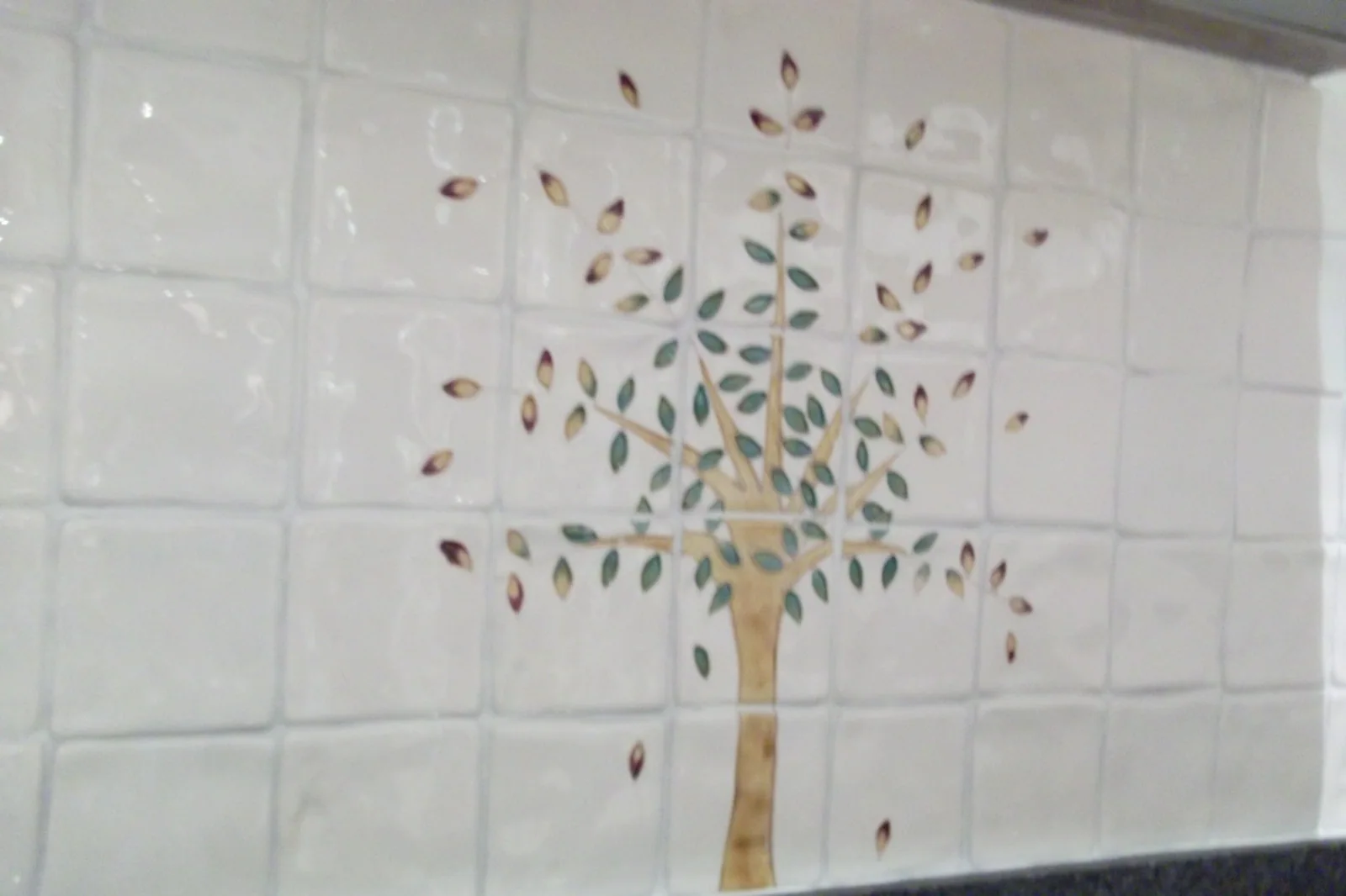
A decorative panel or mosaic strip can provide a focal point without covering every surface. The project gallery includes examples of feature panels, contrasting inserts and simpler layouts.
Choose the joint and the edge as well.
Grout colour changes the way a pattern reads. A close match can make the surface feel quieter; a contrast makes the grid more prominent. Edge trims and junctions with neighbouring materials deserve the same attention as the tile itself.
Talk through the whole combination before ordering. Agree the quantity and cutting allowance, check batch information with the supplier and keep some spare tiles for possible future repairs.